Guild Wars 2 and the LFG Menu
Guild Wars 2 is a massively multiplayer online role-playing game (MMORPG) with an active community engaging in many different types of group activities within a high fantasy-theme world. The community relies heavily on the Looking For Group (LFG) menu to form parties for various different types of in-game content.
However, being a game released in 2012 within little to no UI updates, the LFG tool in particular is often found by the player base to be outdated, unintuitive, and uninspiring. This is especially true for new players and veteran players who are looking to engage in certain types of content quickly.
User research
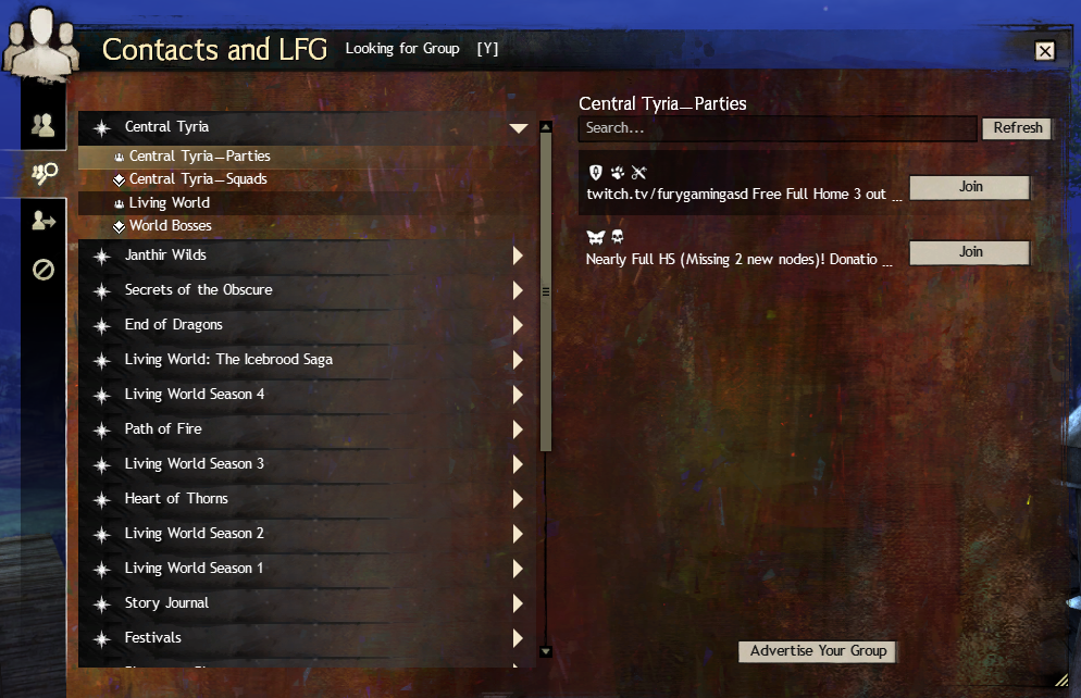
User journey: To being, I mapped out the currently Looking For Group flow, from opening the menu to joining and creating a group, noting the current state of the user interface as well as noting down what I as a player believe disrupts my flow according to what my goal is.
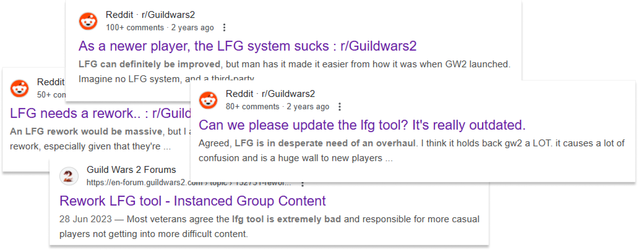
Background research: I then conducted an investigation of the the official Guild Wars 2 forums as well as Reddit to read community feedback on the LFG menu, to identify common pain points and the most heavily requested features.
Interviews: Finally, I entered into Guild communities on Discord, and conducted direct interviews with players on their thoughts and feelings towards the current LFG system as well as what they would wish for in future updates
Pain points


Goals
Being a long time Guild Wars 2 player myself, my aim for this personal project was to improve the LFG menu’s clarity and visual appeal, while still adhering to Guild Wars 2’s classic UI aesthetic.
Reorganize navigation: Structure content types in a more intuitive way
Rework part listings: Add more visual clarity and transparency to the party listings to make information more accessible and quicker to access
Increase visual appeal: Give maps and content types more individuality and aesthetic appeal
Automatic queuing: Add a space for an auto-queue option.
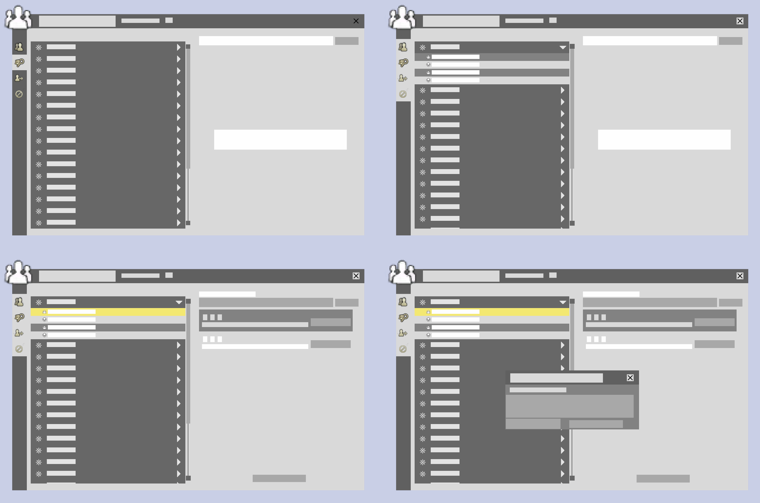
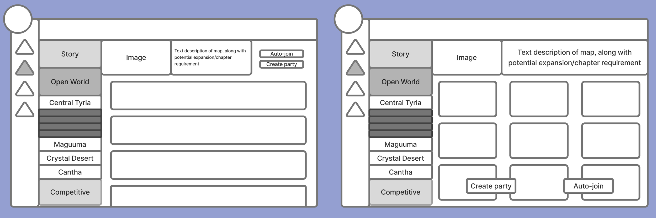
Sketches & wireframes
Here are some sketches and wireframes I created while ideating and and evaluating my idea, before committing to a more hi-fidelity approach.
Pilot evaluations & user feedback
While designing, I actively communicated with Guild Wars 2 players to gather feedback on visual clarity, ease of navigation, and what elements they may have found confusing or missing. Based on this feedback, I incorporated the following iterative changes:
1. Moving around information in the party listings according to priority and relevance
2. Adding the option to toggle the organization of Open World maps in the navigation menu between ‘release order’ and ‘map region’, to accommodate different players’ needs
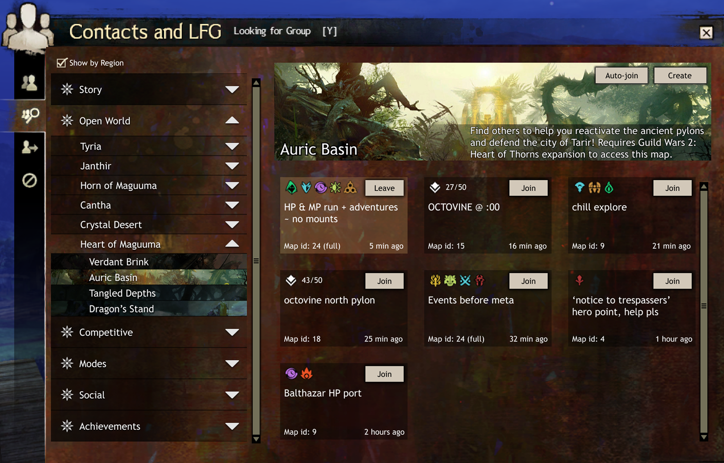
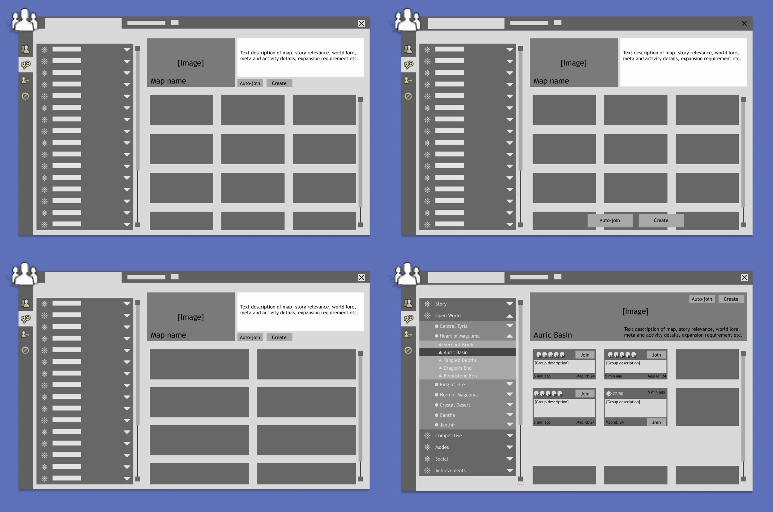
My Solution
My final solution includes a revamped categorization that organizes maps and activities in a more intuitive way, making it easier for players to find what they are looking for. I chose to adhere to Guild Wars 2’s overall UI aesthetic while adding in-game art in the list to make map thumbnails stand out more and provide a glimpse into what the content may be like. The in-game art is visible fully when that map is selected, where listed parties can be seen in three columns.
I incorporated colors and symbols to represent the classes of the players already in the parties. In this way, classes can be differentiated both by color and symbol to account for forms of color blindness. Party listings also have information on when they were created and which map they are in so that players can plan their activities accordingly.
In addition to the option of creating a group, players may also choose the auto join button to automatically get matched with others, to skip the step of having to search for a group or create one themselves
Here are some examples of my final design!